Saturday 27 December 2008

Friday 26 December 2008

Best/Worst.

So, i am determined to create a high quality body of research. And have spent the first week decided what to do it on. Typical of me really, anyway, i got a book for christmas that helped me to decide. I am going to base my project on signs. It's something i would not have thought of unless this book was given to me, immedietly you would nto consider signs to be interesting, but if you are really looking they are, if you take them out of context, change the context, photograph them, think about what they really are - simplified information.
Best or Worst?
Do i want to question the symbol as being sucessful or not?
It could be quite funny to look at the worst signs, maybe i could change the context of the good signs to make them into bad signs.
Go beyond road signs. Look at sign language. How it is unervisal, making it a good sign.
I am going to look at the best signs.
How about looking at superstitious signs.
I am getting a little too excited over all these possibilities.


Saturday 6 December 2008

Tuesday 25 November 2008

Evaluation.

So here it is, deadline day. And now time to reflect...

I hope to think i have fulfilled all the requirements for this module.


BA (Hons.) GRAPHIC DESIGN – END OF MODULE SELF-EVALUATION

Hannah Lloyd.

Level 02 Semester 01 Credit Value 20


1. What skills have you developed through this module and how effectively do you think you have applied them?
I have developed organisational skills in this module I think. Previously I was quite disorganized with presenting my work when it came to submission. I hope that I have improved on this.
Within the module, I have learnt skills in many print processes. Particularly about preparing documents for lithography printing, which I looked closely when, producing the vouchers (good brief) by researching into the printing company “printing.com.”
At the start of this module, for the good brief, I found that I struggled to try and explain my idea, and was told to improve my communication skills! I hope that I have improved on this now, and have started preparing for Crits more, already knowing what I am going to say and show to the group. This also allows for me to gain better feedback from Crits, greatly improving the development of my work. The requirement of presenting A2 boards I think helped to bring my idea together, and this is something I will continue to do throughout the rest of my projects.
I have learnt the things to consider when preparing documents to be sent to print in industry, to consider the cost, the stock, the most appropriate method.

2. What approaches to generating work and solutions to problems have you developed and how have they helped?
I have developed my conceptual skills a lot, thinking through every decision, and the reasons behind every decision. I have stared to make decisions quicker, although I change my mind within my idea too much when it came to deciding on the final deliverables. I have started to develop my ideas more through primary research such as collecting retails graphics. Also doing paper based designs before jumping onto the computer, I looked at existing retail design out there, and this helped me to progress through to my own idea. I also asked around shops to collect envelopes for receipts, this gave e some quite useful primary research, even though I decided not to use this in my final deliverables, the process of going out and talking to shop assistants gave inspiration and ideas.
3. What strengths can you identify in your work and how have/will you capitalise on these?
Starting with the design4print brief, I think that the strengths within my work is the development. I found this just came naturally when designing, I would consider different variations before finalising my idea.
I think the branding of my work – gratis, is quite strong. And I enjoyed the process of conceptualising and pushing the message. I think you can see a clear development of this.
The strongest part of this design4print brief I think is the concept, as I have a reason for all the parts of my package. The bag –refers to shopping and spending money, The voucher – refers to offers and money, The Card – refers to a credit card. And the reason for having everything relating to money is because, nothing in life is free, it may be free from money, but there is always a price to pay.
I also think the research I did from printing.com was quite extensive, including sending off for a package to receive samples, going in and talking to them personally, and working to their requirements for size etc.

4. What weaknesses can you identify in your work and how could you exploit these more fully?
I don’t think I fully exploited the use of printing methods. The bag should have been done through screen print, but by the time I had made this design decision, it was too late and I did not have enough time. I used transfer paper to represent my idea, and imposed design onto the bag using Photoshop, but I wish I could have actually got the design screen-printed.
I started to change my idea quite a lot when it came to deciding on deliverables, I think that I need to be more decisive as this is why I ran out of time to screen print.
I could have done some more extensive primary research, I did go out and talk to shop assistants, but maybe have got more research or opinions from my audience, art and design students.

5. Identify five things that you will do different next time and what do you expect to gain from doing these

1. Be quicker with my decisions within my idea, so that i have more time to produce everything that i want to produce.
2. Improve time management, so that I have time to create or do everything that I want to.
3. More Artist Research to influence my idea.
4. More extensive Primary research, go a bit further than just collecting. Interviews with audience, to allow for more inspiration and ideas.


6.How would you grade yourself on the following areas:
(please indicate using an ‘x’)

5= excellent, 4 = very good, 3 = good, 2 = average, 1 = poor


Attendance 3
Punctuality 4
Motivation 3
Commitment 3
Quantity of work produced 3
Quality of work produced 3
Contribution to the group 3

Tuesday 18 November 2008

Monday 17 November 2008

Sunday 16 November 2008

offset lithography

The main print process i would use in my project is offset lithography. This is the most commonly used print process, where an inked image is transferred from a plate to a rubber blanket and then onto the printing blanket. The offset technique employs a flat image carrier on which the image to be printed obtains ink from ink rollers, while the non-printing area attracts a water-based film (called "fountain solution"), keeping the non-printing areas ink-free.

Offset printing advantages

Advantages of offset printing compared to other printing methods include:

  • Consistent high image quality. Offset printing produces sharp and clean images and type more easily than letterpress printing because the rubber blanket conforms to the texture of the printing surface.
  • Quick and easy production of printing plates.
  • Longer printing plate life than on direct litho presses because there is no direct contact between the plate and the printing surface. Properly developed plates running in conjunction with optimized inks and fountain solution may exceed run lengths of a million impressions.
  • The more you print, the less you pay per page, because most of the price goes into the preparation undergone before the first sheet of paper is printing and ready for distribution. Any additional paper print will only cost the client paper price (and ink), which is very minimal.

Offset printing disadvantages

Disadvantages of offset printing compared to other printing methods include:

  • Slightly inferior image quality compared to rotogravure or photogravure printing.
  • Propensity for anodized aluminum printing plates to become sensitive (due to chemical oxidation) and print in non-image/background areas when developed plates are not cared for properly.

Wednesday 5 November 2008

Local Printers (Leeds)

printing.com Leeds, Third Driest Ltd, Unit 2, St George House, Great George Street, Leeds LS1 3DL.
Approx. 0.4 miles (0.7 km) from you. Map.

printing.com @ Print Ideas, 452 Roundhay Road, Oakwood, Leeds LS8 2HU.
Approx. 3.0 miles (4.7 km) from you. Map.

printing.com @ The Factory, 4-6 Church Lane, Pudsey, Leeds LS28 7BD.
Approx. 4.1 miles (6.5 km) from you. Map.

printing.com Bradford, 73 Manningham Lane, Bradford, West Yorkshire BD1 3BA.
Approx. 8.0 miles (12.8 km) from you. Map.

printing.com @ Siddall Colour, Horncastle Street, Cleckheaton, West Yorkshire BD19 3JL.
Approx. 8.1 miles (13.0 km) from you. Map.

Wednesday 29 October 2008

RGB vs CMYK. Introduction to colour management.

READINGS I HAVE DONE ON COLOUR.

HOW TO DO EVERYTHING WITH PHOTOSHOP, COLIN SMITH.


(UNDERSTANDING COLOUR MANAGEMENT BY ABHAY SHARMA)

Colour management allows users to control and adjust colour when images are reproduced on different devices and media. Colour management is not a trvial subject to understand. Colour management is usually based on profiles that conform to the internationally accepted ICC profile specification. Therefore, it relies on fairly advanced colour science and imaging concepts. 
Colour management has a beauty and simplicity. It is astounding to see the results from a good colour management sytem. 
WHY DOES IT NEEDS EXPLAING?
Colour is perceived by the eye-brain visual system, and our response to colour it based on a number of factors, including such diverse things as the room lighting, what is in the scene, and the mood or age of the obeserver. Colour is a coplex phenomenon. 

COLOUR BY DAVID HORNUG 

We see colour whenever we open our eyes in a lighted space, and colour contrast makes things visible. We perceive qualities like roundness, relative distance, and texture though the brain's inconscious and instantaneous decoding of myriad patches of colour. 

Colour is said to be contained within light, but the perception of colour actually takes place in the mind. As waves of light are recieved in the lens of the eye, they are interpretated by brain as colour. 

GETTING IT RIGHT IN PRINT MARK GATTER

The first thing we need to understand is that RGB refers to different colours of light, whereas CMYK refers to different colours of pigment....


First Things First 2000. A Manifesto For Design.

"The First Things First 2000 manifesto, written and launched by Adbusters magazine in 1999, was an updated version of the earlier First Things First manifesto written and published in 1964 by Ken Garland, a British designer.

The 2000 manifesto was signed by a group of 33 figures from the international graphic design community, many of them well known, and simultaneously published in Adbusters (Canada), Emigre (Issue 51) [1] and AIGA Journal of Graphic Design (United States), Eye magazineno. 33 vol. 8, Autumn 1999 and Blueprint (Britain) and Items graphic design profession's priorities in the design press and at design schools. Some designers welcomed this attempt to reopen the debate, while others rejected the manifesto." (Netherlands). The manifesto was subsequently published in many other magazines and books around the world, sometimes in translation. Its aim was to generate discussion about the graphic design profession's priorities in the design press and at design schools. Some designers welcomed this attempt to reopen the debate, while others reject the manifesto.'


MY OPINION?

I agree that you should have you values and opinions and you choice whether to take a job or not. But you have to work your way up somehow. I do think that design is undervalued from those who have no interaction with the design industry, other than being the viewer of design. Telling my friends that I do Graphic Design for a degree you can tell from their reaction. People assume it is an easy course, a course in Photoshop. Which is far from the truth. But if you talk to those who are involved in art, they will relate with you and Graphic Designers are actually highly respected. One lady once said to me that Graphic Designers are the most talented of artists.

I think this underestimated view of Graphic Designers has come from thinking all graphic design is is, 'advertising dog biscuits, designer coffee, diamonds, detergents, hair gel, cigarettes, credit cards, sneakers, butt tonners, light beer and heavy-duty recreational vehicles.'

However, is it not just a job to fulfil a brief? When we first enter the world of Graphic Design we are going to have to start from the bottom in most cases and work up. The only way to get a feel for the industry and how everything works is this way. Once we get to 'the top' we have to know what we are doing, have some experience.

But the other side to this argument is that do we want to 'dirty' our design reputation with design for dog biscuits? If we are going to get our names our there, should it not be for something more worthwhile?

Understanding Spot colour.


Designers use spot colour
to ensure that a particular
colour in a design will
print. The CMYK gamut does
not cover the full range of
colours visible to the human
eye.Spot colours have
greater intesity and vibrancy
as they print as a solid
colour rather than being
made up of dots.


Spot colours are made from
various base elements, mixed
according to a specific
recipie. The pantone PMS
colour system has developed
to include a wide range of
different colours, uncluding
solid, hexachrome, metallic
and pastel colours.
When printing a spot colours,
it requires its own printing
plate. The more printing
plates you have the more
expsnive the printing process
will be.

Due to expensive costs spot
colours are often the
preferred method of print.
Using two colour variations
is cheaper than having to
go down the four colour
route of CMYK.

This is a good website:
http://www.businesscardsontheweb.co.uk/spot_process_colours.html

Wednesday 22 October 2008

Leeds :)


Another sight I found around town today :) Was by Subway at the bottom of town near the station (ish) The outside of the building was mirrored and curved so it reflected the same image all the way around.

You are a Rock.


Just came across this in Leeds today. Thought the shadowing over this paving stone look pretty. It was interesting how it was the only pavement in the area with a statement/quote on it.

Wednesday 15 October 2008

Machine.

Quite a straight forward brief.

"Time Machine - Development of Communication."
For some reason, the colours have changed on this upload. The outline should be red (like a phone box) and the background a pale orange.

Monday 13 October 2008

Good Design.

New Brief - Good.
Restrictions? None. Just needs to be design for print.
Going to spend the next few days looking for a bit of inspiration before i clarify my ideas/aims.

Artist: Bart de Baets
Party Invitations - 


Tuesday 7 October 2008

Coffee Machine.

My idea behind this, would be to have a line drawing of a coffee machine. 
Something that would be considered useful to students.
And on the illustration could be made up settings? Adapted to the life of a student. 
Such as, instead of the caffeinated button, you could have deadline night. Maybe an instruction guide by the side of it. 


Gunderson Do-All Machine


"The Gunderson Do-All Machine is a colorful, interconnected network of dozens of machines that have been cross-sectioned to reveal their internal operating mechanisms. This artistic feat of engineering was designed by Mark Gunderson to serve as a mechanical tutorial for young and old alike. Created to serve as a fun and educational tool, the Do-All's layout and design allows one to follow the chain reaction from machine to machine while observing the internal cogs, gears and other components that make them work. The variety of machines include an automatically reversing worm gear, a water pump impellar, a governor/gas valve from a 20 horsepower (HP) JC engine, a blacksmith blower/bubble maker, the main line shaft and pulley from an antique corn grinder, a floating gear, a DC 110 volt generator and lights, a 38 to 1 gear reducer, a bicycle light generator, and a fan blower painted to look like a clown. Recent additions include a penny press that creates a commemorative Do-All Machine coin and a rotating satellite dish with cheerful sun and moon images painted on opposite sides."

Don't Panic

New brief is to design a poster for Don't Panic. The theme is..
"Machine."

Definition - 
An apparatus consisting of interrelated parts with seperate functions, used in the performance of some kind of work: a sewing machine. 
A device that transmits or modifies force or motion.
Any of six of more elementary mechanisms, as the lever, wheel and axle, pulley, screw, wedge, and incline plane. 
A typewriter.
A person or thing that acts in a mechanical or automatic manner: Routine work had turned her into a machine. 
A system or device, such as a computer, that performs or assists in the performance of a human task. 
An intricate natural system or organism, such as the human body

I have highlighted the words that have triggered visual 
imagery and ideas. 

Tuesday 30 September 2008

My Statement.

I originally had it has "contact" but after looking at definitions, i think "communicate" would be better. Contact refers more to the act of physically touching someone. Whereas, i am referring more to the contact through communication. 

Communicate - Join or connect. Transmit thoughts or feelings. The exchange of thoughts, messages, or information, as by speach, signals, writing or behaviour. 

Thinking about my image..

Need to pick something out of my sketch book that refers to this statement and that i can use for the colour4print brief. 

I originally used 6 postcards, as i felt this summed up communicate in the simplest way. 

I really need to do a bit more development here, looking into communication and finding an image that will allow me room to experiment. 

Have been doing some studying! Trying to get my head around all this theory. 

Colour management is a process that governs how colour is translated from one piece of equipment in the printing process to another. Gamuts are RGB and CMYK. When a colour is outside of the cmyk gamut it may not be printed as the exact colour you see on screen as it is a best guess replacement. 

Each device used in the graphic design and printing industries produce a certain array of colours called a colour space. 


Monday 29 September 2008

Its Nice to be Nice.

Have a bit of time to kill between sessions at college. Here are some images/designs that appealed to me =) 


Jason Munn.


Subtractive Colour VS. Additive Colour.

Subtractive - the more colours you layer on top of each other the less light is reflected - colours are subtracted so it becomes darker until you end up with black. 

Subtractive colours is what happens when you mix paint, print a picture, or highlight a word on a page.

Additive Colour - The exact reverse of Subtractive colour, the more colours you mix the lighter it becomes.

Additive colour occurs with televisions, computer monitors and all screen based images. 

Additive colours model involves light emitted directly from a source. 


Greyscale.

Greyscale images are distinct from black and white images. Black and white images have only two colours - black and white. Greyscale images have many shades of grey between them. 

Colour images are often built of several stacked colour channels. RGB images are composed of three independant channels for red, green and blue. Being every single channel also a single channel, they can be managed easily as independent greyscale images. 

CMYK


(cyan/magenta/yellow/key back)


Often referred to as process colour, or four colour.

It is a subtractive colour model, used in colour printing.

It works by partially or entirely masking certain colours on the typically white background.

It is called a subtractive model because inks subtract brightness from white.

Traditional printers often use Pantone spot colours when printing Work. Spot colours are mixed like paint and printed one at a time.

-----------


CMYK is a subtractive colour model. used in
colour printing. Where two colours overlap,
only one additive primary is visible.
Blue is formed where cyan and magenta overlap.
Cyan and Yellow overlap to produce green.
Magenta and Yellow combine to form red.
Where all the subtractive colours overlap,
black is produced.

Because of the issue of converting from RGB to
CMYK for printing. It is important that designers
use swatches when designing if an exact colour
is important. Swatches provide the designer with
a printed example of what the colour will look like
on paper. The selected swatch can be entered into
photoshop with a code provided nezt to the swatch

The CMYK colour model is used in the printing process. RGB is produced
using light and nto on a printing page. This is where CMYK comes in.,
The four colour printing process used four printing plates. When the
colours are combined on paper, they form small dots, but the human
eye sees the full image.

When designing on screen you will mostly be
working in RGB, although your printed final
piece will be CMYK. As you can see in the
colour swatched to the left, there is a
slight shift between the RGB and CMYK colours.


Colour4Print

This module is going to be looking at the different colour Systems.

RGB - (red/green/blue - screen based.) 


A colour model using the additive primary colours red, green and blue. Video Systems use RGB data to create screen images. 
An additive model in which red, green and blue light are combined in various ways to produce other colours. 
Short for Red, green and blue; the primary colours used to stimulate natural colour on computer monitors and television sets. 


To form a colour with RGB. Three coloured light beams must be super imposed (reflection from a while screen) Each of the three beams is called a component of that colour.

The RGB model is additive in the sense that three light beams are added together.


Saturday 27 September 2008

So.. back to college.

Feels strange to be back at college again, straight back into the work. This module we will be looking at the colour system based on our summer sketch books.

My theme, from my summer work is "contact." Whilst i was keeping my sketch book of the summer, i recorded conversations, received letters and e-mails and kept a journal of these activities. It was quite a personal sketch book, and does not really have much meaning or make sense to anyone but me.
I am going to carry on with the sketch book even though summer is over as we are most likely going to have to do some more research anyway and i am finding it quite interesting anyway.

Look at this...


One of those adverts that you just think. Thats beautiful!

Wednesday 17 September 2008

Green & Purple.


I decided on these two colours. They are opposites on the wheel and are therefore complimentary colours.  


Sunday 14 September 2008

September 08. Zakynthos.

End of Summer...


How quick did that go?

How beautiful! September 08. Kefalonia. 

Sunday 8 June 2008

Change the world for a five...


This is a book that gave us the inspiration for our project. We like the concept behind it - ways to change the world. Its quite quirky. I have referred to this book earlier on in my blog, but thought i should upload some photos of it.
My favorite is the one above, with a postcard. On the left it says, "Nice to do. Nice to Get. What is there not to like about it?" and then on the otherside is a postcard, with the start already written - i have never told you this, but...
It is something that is just really thoughtful. And is a nice what of interpretating how to change the world - as it is something really subtle but would make a difference.
But it was the idea of type and object that me and jai really liked - you give them something to do and provide them with something to persuade them to do so..

Friday 6 June 2008

Deadline!

So, its the deadline today. Time to reflect? I hope i have done alright in PPD. I have enjoyed doing my blog, and have got a large quantity of stuff of my own work and artist research. However.. was not very organized with all my evaluations eek. Hopefully that part wont affect me passing or failing, as i think i have been reflecting and evaluating as i went along it notebooks and sketch books. I do feel i have learnt aaalooot this year, it took me a while to get into it but i really think i work in a different way now and for the better - concept audience and message!!! =)

Thursday 5 June 2008

....

Graphic Design is...

Anything.


That solves a problem visually.

Speaking from Experience Final Crit

I thiiiink it went alright, was hard to tell if people thought it was successful. I don't think people realised that our aim was to make there uni experience more enjoyable and help people who are missing home.
What we need to do now - re-craft some of the postcards. Jai is making hers now. And then i need to sort out packaging. Blah.

Can't wait until this is done! I do love this project but it is getting a bit tedious now, trying to make it perfect!

Wednesday 4 June 2008

Sao Paulo No logo: the effect of a city without advertising

I read about this in creative Review aaages ago, but it just cropped up on a blog i came across.

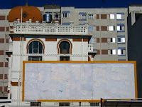
"For the past eight months, Tony de Marco has been documenting the systematic removal of all advertising in the city of São Paulo. Since 1st January 2007 São Paulo has been living under the new ‘clean city’ law, this bans all advertising: no billboards, no fliers, no neon signs, no electronic panels – a blank city "