Sunday 8 June 2008

Change the world for a five...


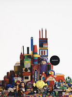
This is a book that gave us the inspiration for our project. We like the concept behind it - ways to change the world. Its quite quirky. I have referred to this book earlier on in my blog, but thought i should upload some photos of it.
My favorite is the one above, with a postcard. On the left it says, "Nice to do. Nice to Get. What is there not to like about it?" and then on the otherside is a postcard, with the start already written - i have never told you this, but...
It is something that is just really thoughtful. And is a nice what of interpretating how to change the world - as it is something really subtle but would make a difference.
But it was the idea of type and object that me and jai really liked - you give them something to do and provide them with something to persuade them to do so..
Friday 6 June 2008

Deadline!

So, its the deadline today. Time to reflect? I hope i have done alright in PPD. I have enjoyed doing my blog, and have got a large quantity of stuff of my own work and artist research. However.. was not very organized with all my evaluations eek. Hopefully that part wont affect me passing or failing, as i think i have been reflecting and evaluating as i went along it notebooks and sketch books. I do feel i have learnt aaalooot this year, it took me a while to get into it but i really think i work in a different way now and for the better - concept audience and message!!! =)

Thursday 5 June 2008

....

Graphic Design is...

Anything.


That solves a problem visually.

Speaking from Experience Final Crit

I thiiiink it went alright, was hard to tell if people thought it was successful. I don't think people realised that our aim was to make there uni experience more enjoyable and help people who are missing home.
What we need to do now - re-craft some of the postcards. Jai is making hers now. And then i need to sort out packaging. Blah.

Can't wait until this is done! I do love this project but it is getting a bit tedious now, trying to make it perfect!

Wednesday 4 June 2008

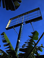
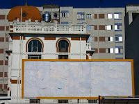
Sao Paulo No logo: the effect of a city without advertising

I read about this in creative Review aaages ago, but it just cropped up on a blog i came across.

"For the past eight months, Tony de Marco has been documenting the systematic removal of all advertising in the city of São Paulo. Since 1st January 2007 São Paulo has been living under the new ‘clean city’ law, this bans all advertising: no billboards, no fliers, no neon signs, no electronic panels – a blank city "


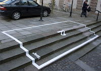
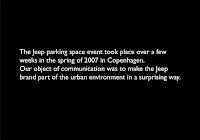
Jeep Parking


What a clever way of advertising! It's just so clever, when i see something like this i like to try and work out how they thought of this ideas, work out the train of thought. However, general opinion of this advert seems to be that it has already been done before, i have never seen it, but if it has then it makes it less exciting!

Speaking From Experience

My part of this project is almost finished now! :) Just need to work on the packaging a bit.. well alot ..
Am really happy with the outcome of my postcards, especially the halls category, because those postcards are quite interactive i think with how they have been designed.


These are the best ones i think (above)

I am really impressed that we managed to find some magnetic material that you can print onto too! Its not verrrry magnetic so have had to put it in a little package but it still has the same effect :) A big weight of my shoulders now i have got the majority of this done.
Jai's should be done soon, and then the crit tomorrow.
We are going to aim to have it completed by Thursday so that we can spend the evening doing ppd stuff and then not have to stress over the weekend - we do have alot planned already!!

Lets just hope they do not rip it in the crit....

Sunday 1 June 2008

Amelia Roberts.


Global Warming.
A set of two posters commenting on how the West blame China’s carbon emissions as a main cause of Global warming. Yet
the West seem unaware that they are fueling China’s industrial revolution.

I like how they are a set of posters. It tells a story, making it quite easy to understand. The use of the two labels - "Made in China" and "Brought by us" - are so clear and straight to the point, i think it is an appropriate typeface as well, it is the type that would actually be used on these products when it actually says made in china. I think its a play on words is well, as we are labeling china as the cause for Global Warming.
The best bit of this design is how the object have been positioned in the shape of a factory and then the second poster has been manipulated to get a destruction feel to it.

us design studios.


This is a design group that i included in my Presentation, I think i work in a similar way to this design group, as they work conceptually like i do.
I like how literally they have taken the idea of comparing workers to that of conditions that chickens live in.

The way chickens are handled and cared for are continually on debate, i know more about this topic than i do about the working conditions of humans. Because the majority of us eat eggs, the care of the chickens is something we are kind of responsible for. It is something we all seem to understand, as there as been so much about it on the news.
Working conditions are a bit of a rare topic to be debating, so putting the human into the package of the chicken kind of brings back familiarity and understanding, it gives us something to compare it on. The concept of comparing Office working conditions to Free range chickens is just really strong, and the way they have dealt with it is even better. The fact that they have packaged the human in such a clever way makes the message so much more straight forward and clearer. The design has obviously been clearly and really thought out, as every detail is considered - the way the human is positioned, the text and materials. It is just very well done!

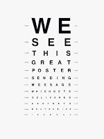
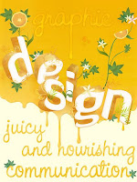
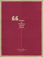
What is Graphic Design Posters?


My Interpretation of Graphic Design...

I still have a similar understanding of the term Graphic Design as to the start of the year, i would just say i have a clearer one.
I see Graphic Design as a visual art that communicates a message to a specified audience. It is a broad subject, that can be broken down into many categories - Typography, Image, Photography, Print, Publicity, Packaging, Illustration, Moving Image, Web Design. Graphic design is a Visual Language, in my mind it actually is it's own language expect that if designed well the designs can be universally recognized regardless of culture - for example, the coca-cola logo. Unlike, the spoken word it can not be understood worldwide. This is what is so great about art & design. There are those that prefer to express with a spoken word, and those that can express through art and image. But everyone can understand, or at least take away their own interpretation, of something that is expressed with art.

What is the point of Graphic Design?

Sounds quite cliche.. but think about the world without it. It would be dull and boring and no visual identity. It allows for companies and people to express themselves via image, to get themselves known. Design makes our community much more interesting.

Oscar Wilde


It is very much more difficult to talk about a thing than to do it.......


Exactly! Trying to do my presentation now.
When I came to the college in September I was convinced that I was going to specialize in typography. I would always look to David Carson for inspiration as I thought he had a unique typographic style, I enjoyed the way the way he played with the relationship between the letters and would continually push the boundaries and break the rules of traditional text layout. Having come straight from A-level, I felt I had a lot to learn in my first year. I lacked in confidence, organization and time management. This pretty much showed through in my very first projects.


I felt the turning point for me in my first year was the Timeline Brief. (top of slide) I think the fact that it was a long brief abled me to really get involved with the topic and work out my best way of working. It was with this brief that I realized I had an interest in the exploration of media. I was not happy with my final piece of this project, but I felt I learnt a lot from the development work. I realized I need to pay attention to the little details. I spent too long experimenting and would have benefited from making snap decisions and setting aims to complete certain aspects of the project. I think as a whole, this project would have been a whole lot more successful with better organization. I also started to realise that my strenghts were more in image than type. Next was the Photoshop brief, (bottom of slide) I really enjoyed this brief and I think it shows in my final pieces. I started to realise to important of message and chosing the appropiate media to get the message across clearly and successfully.


The project that I enjoyed the most was the book of 100 keys. I enjoyed the experimenting with materials, even if I knew it would not be included in the final resolution, I aimed to explore as many different materials as possible just to see what results I would get. I like the final piece here as I think it shows that I am a conceptual thinker, as I really challenged what the definition of a book is. I felt a book of keys would only get the message across if it were to be displayed in this way. From this brief I also learnt that categorizing lists will always make better design. As I started off by just having a bunch of keys, but I then split them into two groups - fantasy and realism. The realistic category represented in a way keys normally would be. And the fantasy category is represented in an unusual way for keys to be displayed.

I have had very little experience and practice in drawing (shown on left) and I think this is still an issue and something that I need to work on next year. However, towards the end of the visual language module I started to enjoy experimenting with different media and methods of creating line. However, I think the problem is that I am still experimenting trying to find my own style and technique for drawing. On the right, is my final piece for the calendar brief. I think, also like the books of 100 keys, it helps to sum up my style. That I am a conceptual thinker. The year that I designed the calendar for was 1929, the year of the wall street crash a financial crisis. Once I had decided on an audience, and message - that it was a year of financial crisis, at first for America but then this spread worldwide. The design for creating the calendar onto dollar notes just followed as I had clearly identified the message –money and the Audience – America/a.


A book that I have been constantly referring to throughout the first year, Is one called all messed up by Anna Gerber. As a whole the designers within in it push the boundaries, and consider message and audience to be an important factor. It looks at graphic design that goes beyond pen and paper. But it’s not just designers that give me inspiration; often films and music inspire me. A film called, My Blueberry nights, helped me with my keys project. As the opening of the film is based in a café, where various customers had left their keys for someone else to pick up but more than often the other person would not pick them up. So the café owners is left with a jar of keys, each key having a story behind them as to where they came from. Therefore making me realize it was the identity of keys that I found interesting.

A design group that I have found very inspirational is one called usdesignstudios. They are newly graduated and formed studio who strongly believe that designs stems from good ideas.
The images left were created to show the resemblance between many office working conditions and battery farmed hens. The fact that a human has been packaged and labeled as if a chicken would be, makes the message so much stronger and clearer. I think I work in a similar way to these designers, or at least I aim to, as I think message and audience is the most important aspect of design. Once you have a clear message and audience set up, the design just follows.

I have started to create my own personal sketchbook/notebook. I quickly started to realize the importance of keeping such a sketchbook. It is something you can carry with you everywhere you go, collect materials, record and note anything you find interesting. Keeping this notebook also helps me to keep organized as all my notes are kept together. I have also started to create timetables, and set deadlines within projects in order to help me complete a project successfully.


What is Graphic Design?

Dictionary Definitions of Graphic Design...

Any form of visual artistic representation.

The use of graphic elements and text to communicate an idea or concept

The process and art of combining text and graphics to communicate an effective message in the design of logos, graphics, brochures, newsletters, posters, signs, and any other type of visual communication.

Graphic design is the process of communicating visually using text and/or images to present information, or promote a message. Graphic design practice embraces a range of cognitive and aesthetic skills and crafts, including typography, image development and page layout.